
Diddams
“Building the best ecommerce experience for careful critics”
Project
Spec project
Timeline
2 weeks
Team
Self-Directed
Tools
Figma
My Role
UX Research, usability testing, interaction design, prototyping
GOALS
Diddams built a non-ecommerce website but they’re not happy with the results because the website visitors could not purchase party supplies online.
Diddams was looking for a website revamp to make it more user friendly.
My goal was to build an ecommerce website for Diddams and provide helpful features for my target user, a careful critic.
For this project, we were provided with an inventory list as well as the persona.
PERSONA
Meet Laura, a careful critic who evaluates different products before making purchase decisions.
PROBLEM STATEMENT
Laura, a careful critic, needs a way to compare multiple items and read customer reviews in order to purchase decent party supplies because she values the product’s quality the most.
HOW MIGHT WE’S
HMW make the users feel confident about a purchase?
HMW support users to efficiently compare multiple products?
HMW allow the users to read reviews of each product?
C&C ANALYSIS
I conducted a competitive analysis with Bonjour Fete, Meri Meri, Americans Favors, and of course, Party City.
From here I drew inspiration to include these features:
Providing multiple images of each product
Recommending similar or related items
Detail product description
I observed what Best Buy, Keurig, and Amazon do to allow the users to compare products and read reviews.
All three websites provide:
Comparison tools
Product ratings
Customer reviews of each product.
-

Best Buy
Best Buy lets the users pick the items they want to see side-by-side
-

Keurig and Amazon
Display comparison charts of related items or experts’ recommendations.
CARD SORTING
To improve website navigation, I conducted an open card sorting with 74 items.
I categorized the items into the most sensible arrangement and tried to keep the top-level categories to less than 5.
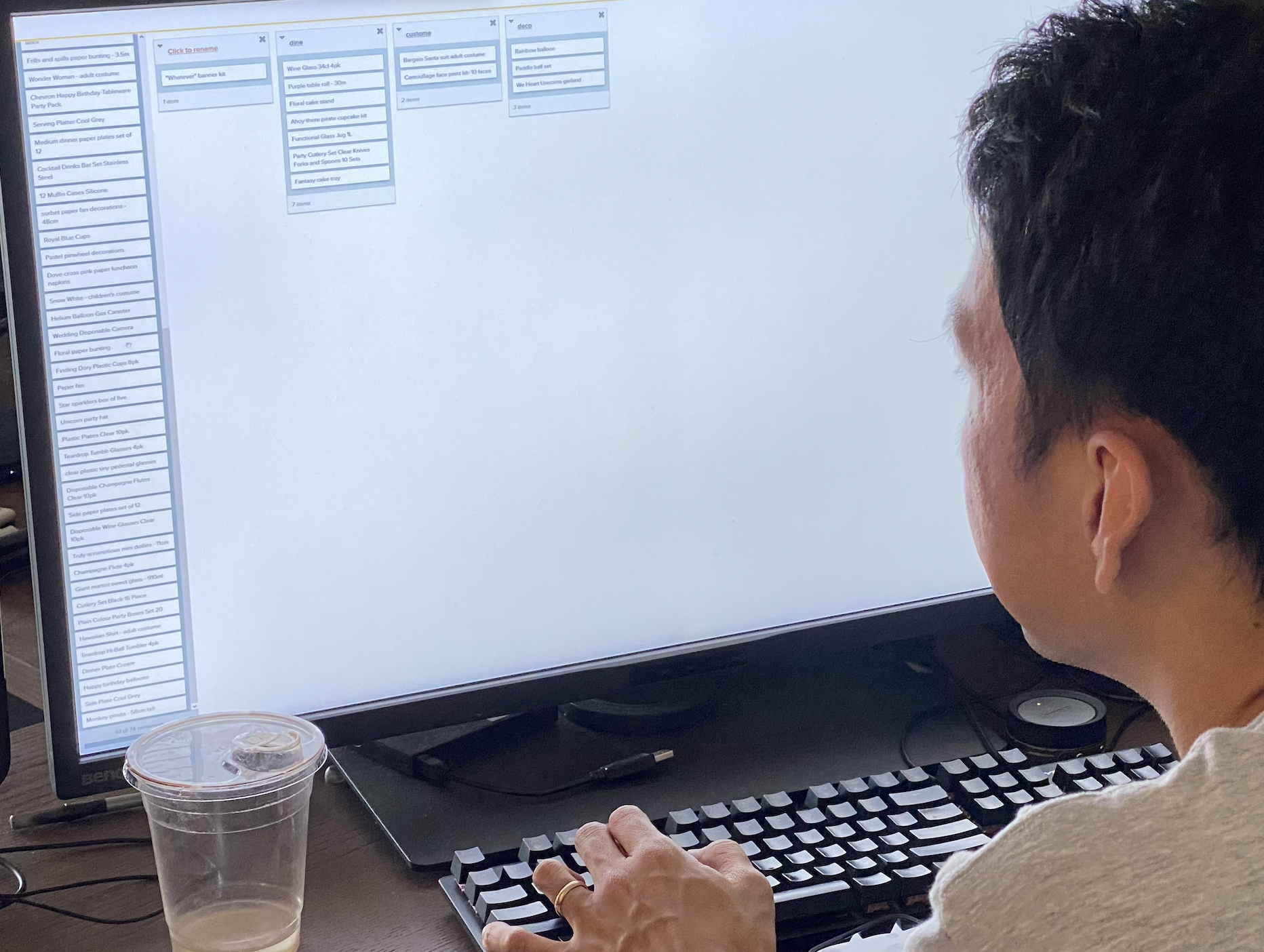
CARD SORT RESULTS
83% of my participants agreed that these products belong to Tableware, Cutlery, and Disposable Utensils
So I labeled them as Tableware to make it broad enough to cover everything.
I color coded the items into four categories which became my primary navigation
Then sorted them even more specifically to make secondary navigation.
Sketched the website’s navigation
I put the store’s contact info and rewards input field under the footer.
USER FLOWS
Flow 1
Find a product, read reviews and go through a full checkout process.
Flow 2
Compare up to 4 items at once.
SKETCHES
Focused on Laura’s needs: Detail product descriptions, customer reviews and comparison tools.
-
![]()
Home page
-
![]()
Product page
-
![]()
Descriptions & Reviews
-
![]()
Your Cart
-
![]()
Comparison tool


LO-FI PROTOTYPE AND USABILITY TESTING
I conducted a usability testing with 5 participants to learn about the effectiveness of my initial design. The flow started from reading product reviews, comparing multiple items at once and completing their purchase online.
USABILITY TESTING INSIGHTS
Unclear what “Party Funs” refers to
Users did not know Party Funs includes camera, sparklers, game sets, etc.
Filter and Sorting buttons are confusing
4 out of 5 users clicked the Sorting button to filter by rating.
Missing the review snapshot
Negative reviews are essential to users when they shop online because they have to know if it is about the quality of the product.
Hard to digest with too much texts
Users anticipated less texts in the comparison chart.
CHALLENGES
Don’t forget accessibility!
More than half way through my iteration process, I realized I made poor color choices because some of the texts were hard to differentiate from its background.
To make my content accessible, I made sure there is enough contrast between the text and background.
Solution
Flow 1
Browse products and filter them by rating
The filtering options will give the user better control of browsing similar items and quickly find products with good ratings.
After the testing, I changed “Party Funs” to “Entertainments.”
Flow 2
Add items to the comparison tool after reading descriptions and reviews
Filter the reviews by score using the review snapshot and compare up to 4 items at once.
Flow 3
Purchase the item after comparing
Complete your ecommerce experience with simple checkout process!
What I learned
Picking the right color palette was tough, but I appreciated the mistake I made on color contrast.
I learned that picking accessible colors is something I should not overlook as a UX Designer and must be sure the contents are readable for as many people as possible.
What’s next?
Instead of having shoppers pick the products they would like to compare, it would also be helpful if the website auto-populates the comparison chart with popular items like Keurig's website does.
This can be beneficial for users like careful critics because they might come across a product with better features or better quality that they didn’t know about.