HITMKR
Project
Client project
Timeline
3 weeks
Team
4 UX Designers
My Role
UX Research, UX/UI Design
CONTEXT
HITMKR is a growing platform for musicians and producers to buy and sell music tracks.
A key business goal for HITMKR is to grow from an e-commerce site into a music collaboration platform where the musicians and producers’ originality is valued, rather than creating type-beats.
PROBLEM
The website does not fully assist musicians and producers with more content interaction.
Users are not provided with robust offering of tracks to discover upon arrival to the site nor search filters, the user flow for uploading beats is unclear for producers, and the checkout UI does not gain user trust.
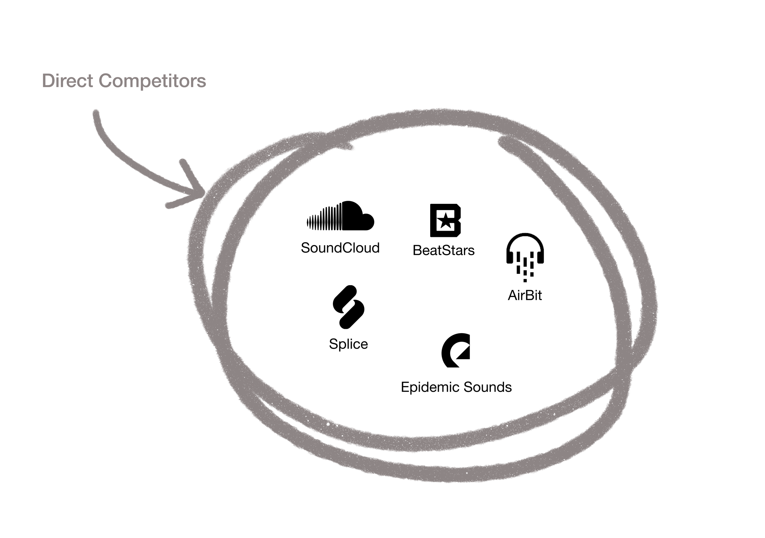
C&C ANALYSIS
👍 Users are provided with robust offerings of related contents when keyword searches are vague
👍 Assist users with initial search queries
👎 No tag suggestions are provided

👍 Etsy emphasizes that the contents should be tagged only with accurate and relevant words to increase the listing’s exposure
👍 Provides personalized recommendations
HEURISTIC EVALUATION & CONTEXTUAL INQUIRY

84%
of users are not fully satisfied with the discovery process
66%
of producers felt the current upload process should be more intuitive
85%
of the users felt apprehensive with the checkout page
PERSONAS

Rapper
Isaiah Song | 27 y.o. | Los Angeles
Isaiah has an idea of what he is looking for, but never knows the right tags to search.
Frustrations
Lack of results when searching
Unable to narrow down the search results
Checkout process is not smooth

Producer
Mike Blair | 30 y.o. | New York
Mike knows tagging is key for sales, but this can be a pain for each song so he wishes there was a faster system.
Frustrations
Too much friction when uploading music
Unclear search functionality
USER FLOW

OUR TEAM’S SOLUTION
After 3 rounds of usability testing with 5 producers, 5 musicians, and 2 general user test participants,
our team was able to enhance the search functionality and create an efficient upload process for producers.


I decided to give our team’s designs a ‘facelift’ with more consistency in UI elements and layouts.
TYPOGRAPHY

COLORS

ICONS
GRIDS

Dark mode!
Most music makers work at night, so I decided to create a dark mode.
I ensured a high contrast ratio to create more inclusive typography on the web.
01
Enhanced search functionality
Users have options to browse contents on the homepage and search with tags.
The website provides users with better control of narrowing down their search results.
02
Efficient upload process & tagging system
Users can easily tag their music with only a few clicks, allowing for easy SEO.
Information about licenses and producer voice tags is available for producers to make sure what they’re selling.
03
Secure checkout experience
Displaying a Stripe trust badge makes the payment page more trustworthy.
Users can review the license & usage terms on the checkout page.
MOBILE DESIGN

Browse

Filter

Listen
Listen and purchase beats on the go
A web based mobile app offering simple search and filtering options
What I learned 🎉
A good UI is the crux of user trust.
Initially, users felt hesitant about the checkout page but once we integrated Stripe’s trust badge at the bottom of the payment forms, users felt secure with their personal information.
I also learned that satisfying visuals and consistency make the product appear trustworthy.
What I’d do differently next time 💁♀️
Do more research
Not only observing our direct competitors’ features and flows, I would also observe their users’ pain points when using the product. Collecting the data about what other platforms need to improve on would also help a lot to make HITMKR stand out amongst the competitors.